 Rice University alumnus Skyler Johnson (B.S. in CS ’11) turns data into art using math and a computer, and his favorite data to visualize involves music. So he applied to Spotify in 2017.
“I applied cold, online,” said Johnson. “I didn’t have a reference, didn’t know anyone there. But I ended up getting a call, then an interview, then an offer. And working on data viz with Spotify data is just as much fun as I anticipated.”
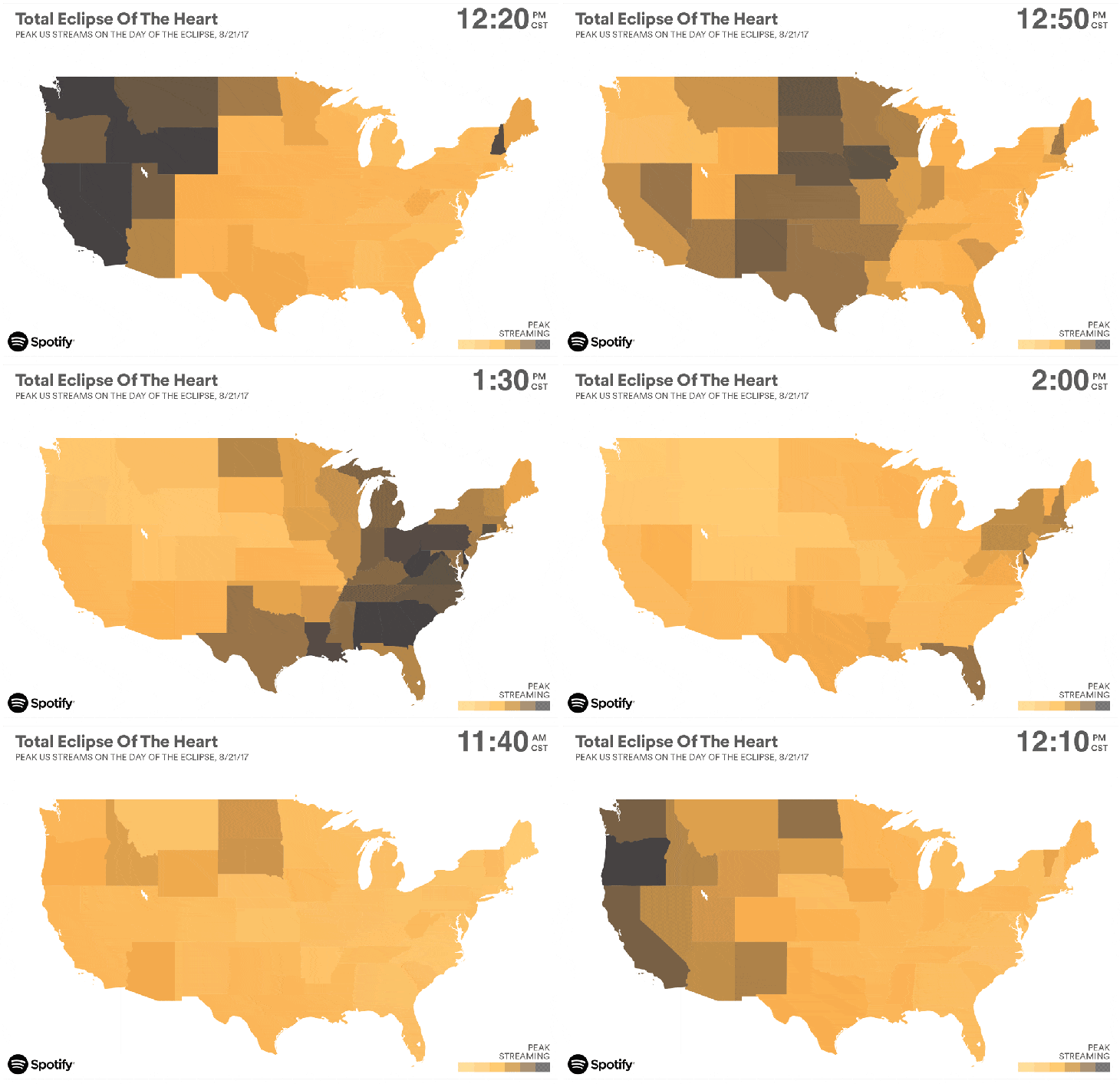
One of the visualizations he created for Spotify is a gif that traces the number of times Bonnie Tyler’s “Total Eclipse of the Heart” played on Spotify in each U.S. state during the August 2017 solar eclipse.
Johnson said, “The visualization was built in Tableau. Each time frame was exported as an image and stitched together into a gif.”
Although he makes it sound easy, Johnson had been creating increasingly complex data visualizations with Tableau for several years before he applied to Spotify. Initially, he discovered Tableau while evaluating enterprise reporting software for his Accenture clients who wanted to ‘drag and drop’ data from their tables into graphs and charts.
Johnson said he dove into Tableau, teaching himself by creating his own visualizations and dashboards around music festivals and favorite bands. He used APIs and scraped websites using Python to gather more data.
“I entered a data visualization competition hosted by Tableau Public around the theme of music, which I won. The prize for winning was a trip to Las Vegas, for an even bigger competition at Tableau Conference called ‘Iron Viz’. I didn’t win there but I did realize data visualization was something I really wanted to do. I read as many books on it as I could and took an online statistics course to remind myself of all the math concepts.
“Soon after, I moved into a new role within Accenture where I concentrated on data visualization consultation and my customer base continued to grow. On the side, I kept producing fun data visualizations for my public profile on Tableau. The more I published, the more attention my work drew.”
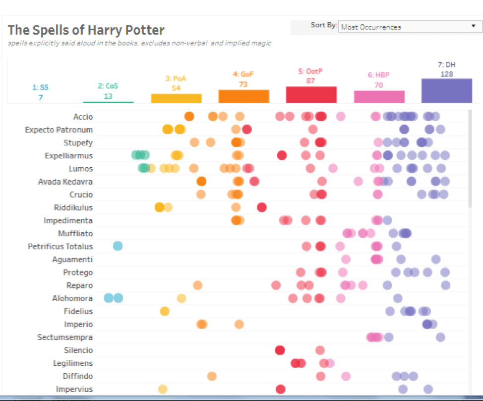
One of his most popular graphics was The Spells of Harry Potter, showing the number of times specific spells are said in each of the seven books. The visualization has been viewed over 428,000 times.
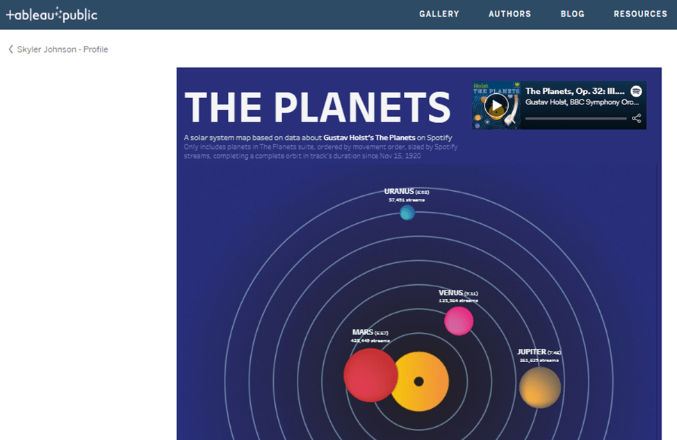
He also created a visualization of Instagram followers for each of the contestants in Season 10 of Ru Paul’s Drag Race, a reality, television pageant. The graphic updates itself daily. Another of his popular visualizations is a solar system map based on data about Gustav Holst’s The Planets, as the suite is steamed on Spotify. For the animated version, see his website: http://www.skybjohnson.com/theplanets.
Before he became captivated by data visualization, Johnson had focused on the user experience (UX) and human computer interactions (HCI). As a sophomore at Rice, he worked out a capstone plan that included courses in computer graphics as well as Psychology.
The Psychology classes taught Johnson how a human interacts with a computer and how to write code to support or enhance that interaction. The graphics courses taught him to create three dimensional images from flat data.
He said, “Learning to create computer graphics in COMP 360 and 460 was both challenging and satisfying. COMP 360 probably spearheaded my career direction, even though it is by far the hardest course I’ve ever taken. That course revealed how math is the code that can generate visuals. It pushed me to my limits – and beyond – because it required advanced math to visualize, render, and manipulate objects in 3D space.”
Johnson and his project partner struggled to render a 3D rabbit. He said it required long hours and several all-nighters to get all the colors right and make the rabbit appear multidimensional.
“It really tested our abilities, setting a perspective of the polygon in 3D, getting it to rotate. Later, I learned that’s a pretty common academic exercise, but I went into it not really knowing if it was something I could do. When we got the bunny to render, it felt incredibly satisfying.”
He said the final project in Dan Wallach’s Applied Algorithms and Data Structures course (COMP 314) required students to take a random art image and apply formulas to it, creating deviations on the original –an approach Johnson still uses today.
“I feel I’ve actually done similar things here at Spotify. Taking big data and visualizing it, watching data transform into these random art images. It is sometimes hard to see the final result when you are just starting but in my mind, I’d lay it out using the same skills we learned at Rice. Those projects in COMP 314 and 360 helped me turn math and code into visual images.”
Although Johnson intended to pursue a career designing and improving interfaces for apps and consumer platforms, he worked for six years as an Accenture consultant.
“I knew I didn’t want to work as a software engineer, and technical or visual consultants can impact UX by working as an intermediary. The consultant balances business requirements against the developers’ and database engineers’ priorities and restrictions, so my CS training was incredibly beneficial,” he said.
For example, the Introduction to Database Systems course (COMP 430) he had taken was not particularly relevant to his capstone, but it gave Johnson such a solid understanding of databases that he quickly mastered the use of Excel at Accenture.
“In consulting, you practically live and die in Excel. Most of my colleagues hadn’t had much experience in that, but I had a strong background on how databases work, how tables work, and how you can transform and change them. Because I was so good at Excel, I had opportunities to work on business intelligence and reporting projects, which in turn led to my exploration of database enterprise software and Tableau.
 Johnson said, “Tableau helps me create and share things I love in a visual way. I knew music and it had been a dream of mine to do visualizations of music data for work. At Spotify, truly every day is a great day because I get to do something I love –visualization– with data I love – music.”
Skyler Johnson completed his B.S. degree in Computer Science in 2011.


